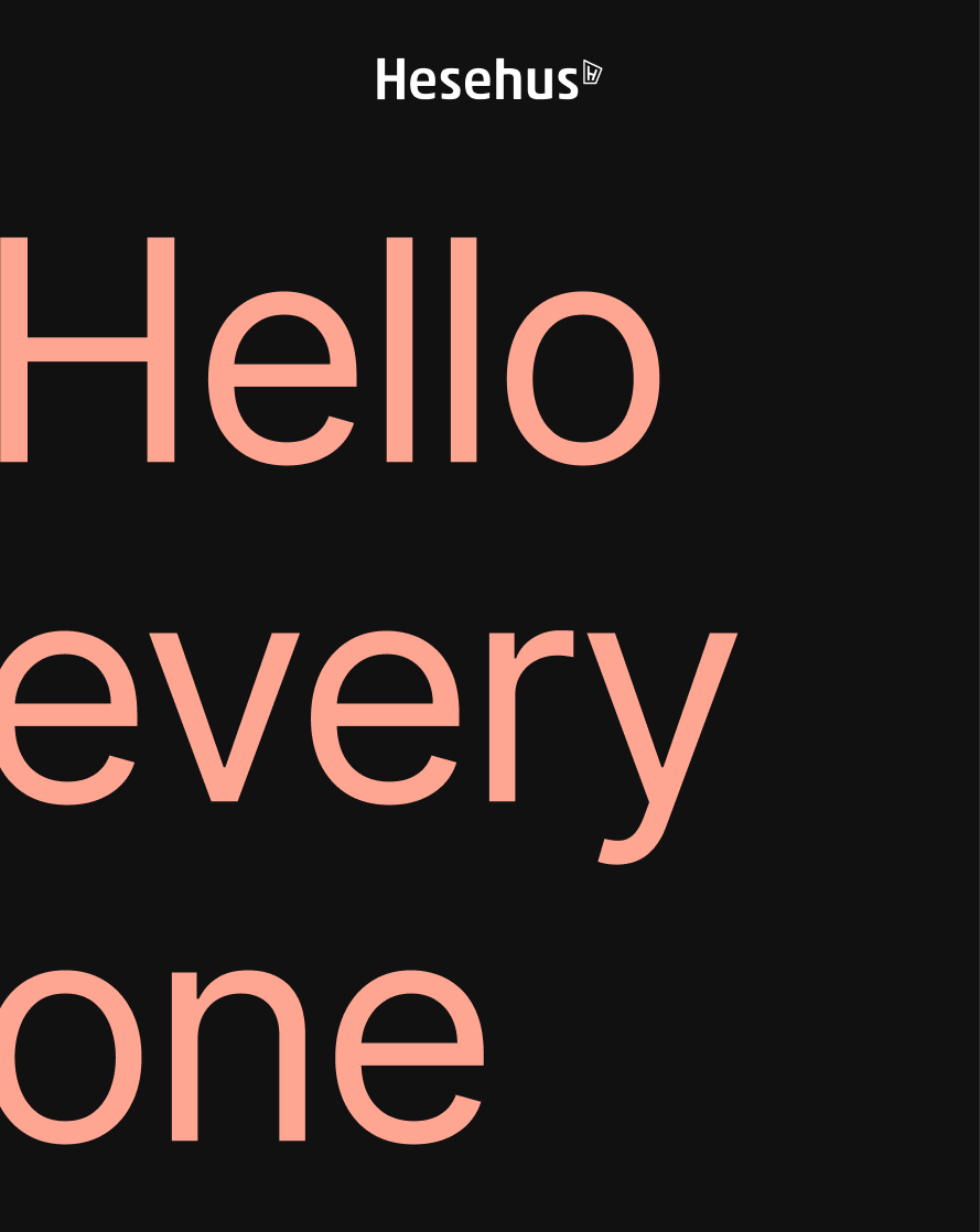
RebrandingHesehus
Creating a fresh, new visual identity for Denmarks leading e-commerce company.
RESONING
The company needed a refresh of its visual identity to better reflect its growth and position in the market.
The rebrand focused on simplifying the overall visual expression—narrowing the color palette, refining the design system, and creating a more minimalist and structured look. A key objective was to ensure clear visual consistency across all touchpoints and media. The result is a clean, focused, and performance-driven identity that communicates both maturity and momentum.
View brandbook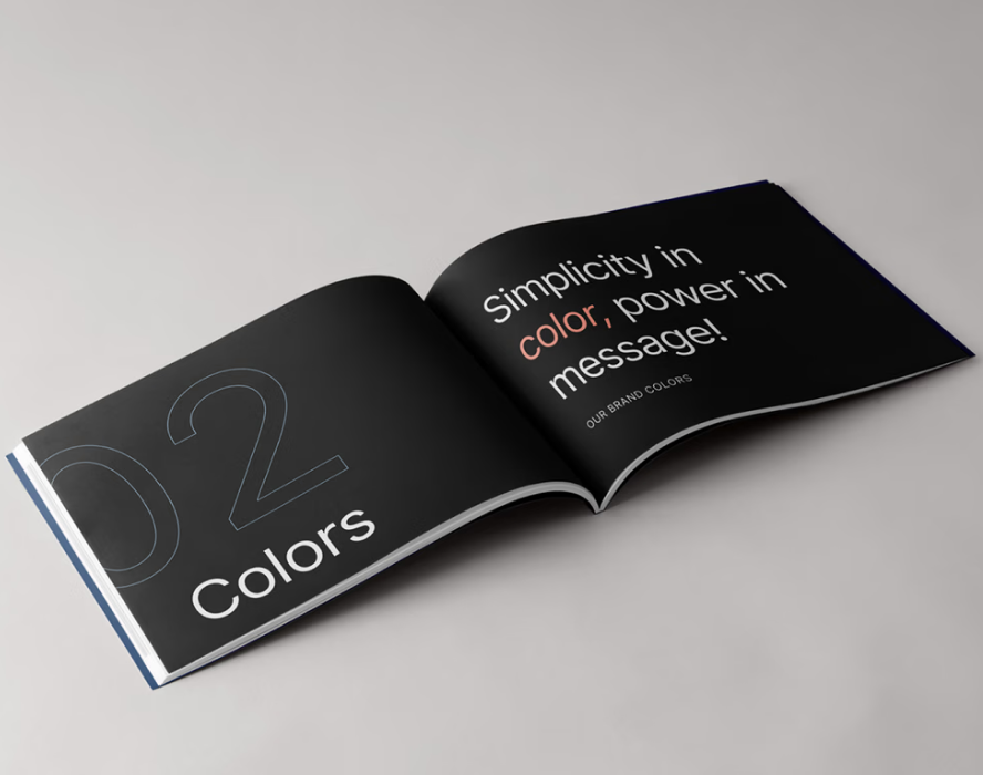
Rebranding Hesehus
To bring the new identity to life, the rebrand introduced bold typography and purposeful use of motion, giving the brand a sense of energy and modernity. Color is used sparingly but strategically, creating contrast and clarity while supporting visuals and brand identities showcased in the customercases.
By integrating more motion across digital platforms, the brand now communicates in a more dynamic and engaging way, capturing attention and enhancing the overall experience for the audience.