PackagingDesign
Visual Identity and packaging design for a fictitious probiotic supplement.
Playful packaging design
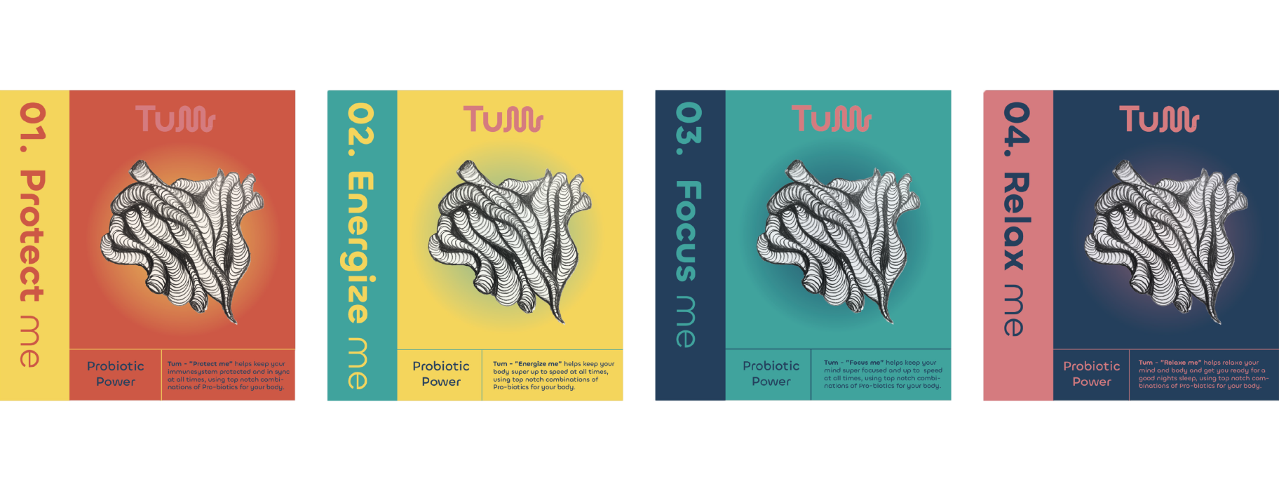
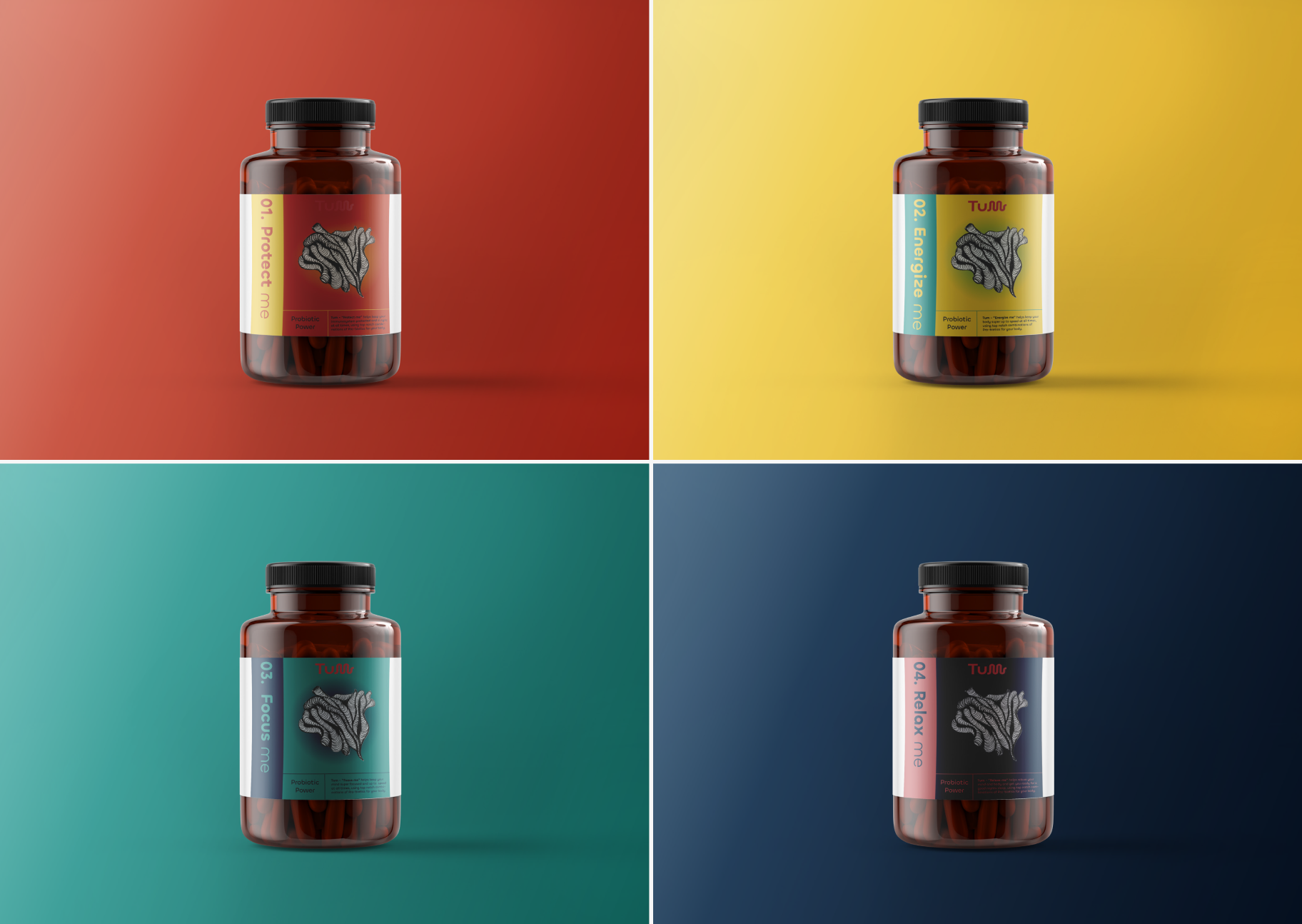
This project explores packaging design for a fictional probiotic supplement brand called Tum.
The concept takes a playful and slightly “in your face” approach, using hand-drawn, organic shapes inspired by the body to visualize the product in a more direct way.
Bold contrast colors and rounded typography are used to create a strong and eye-catching expression, moving away from the typical clean and clinical look of supplements.
Inspired by Nordic beer labels and their use of playfull illustration, the design leans into a more experimental and almost Japanese-inspired style.
The result is a packaging concept that feels playful, different, and made to stand out.

Let's collaborate Let's collaborate Let's collaborate Let's collaborate Let's collaborate Let's collaborate Let's collaborate Let's collaborate Let's collaborate